
This is so cool. Crispian Jago has posted an interactive “subway map” of modern science. It resembles the London Underground map. Mouse over or click on each “stop” to learn about the contributions of a modern scientist.

This is so cool. Crispian Jago has posted an interactive “subway map” of modern science. It resembles the London Underground map. Mouse over or click on each “stop” to learn about the contributions of a modern scientist.
The Guardian (UK) has an entertaining graphic presentation of the year in review. You can find it here.

Here is an amazing mind map prepared for the Joint Chiefs of Staff for our new surge in Afghanistan. Now I see how we are going to be able to begin withdrawing troops in 18 months . . . I think. Richard Engle of NBC News tries to explain, here.

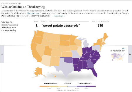
The New York Times ran an interesting interactive infographic that showed state-by-state foods served on Thanksgiving Day. http://bit.ly/6cUQ81
Hans Rosling of Gapminder.org explains 200 years of growth in income and life expectancy in under 5 minutes.
The Geography Department at the University of Kansas has mapped the frequency of the 7 Deadly Sins around the country. The methodology and the the maps (click on the maps to move between the sins) are found here: <a href="http://www.lasvegassun.com/news/2009/mar/26/one-nation-seven-sins/.http://www.lasvegassun.com/news/2009/mar/26/one-nation-seven-sins/.</span>
NPR has an interactive graphic to help explain the power grid in the US. http://www.npr.org/news/graphics/2009/apr/electric-grid/
Here is a link to a Google Mashup showing the spread of the H1N1 Swine Flu in North America. http://tinyurl.com/cywddc
May 2, 2009: A note on this site says that it is no longer being updated. It refers you to http://flutracker.rhizalabs.com/, where they are maintaining an updated database.
The International Chamber of Commerce has a Google mashupthat provides details on acts of piracy around the globe. You can find itby clickinghere.